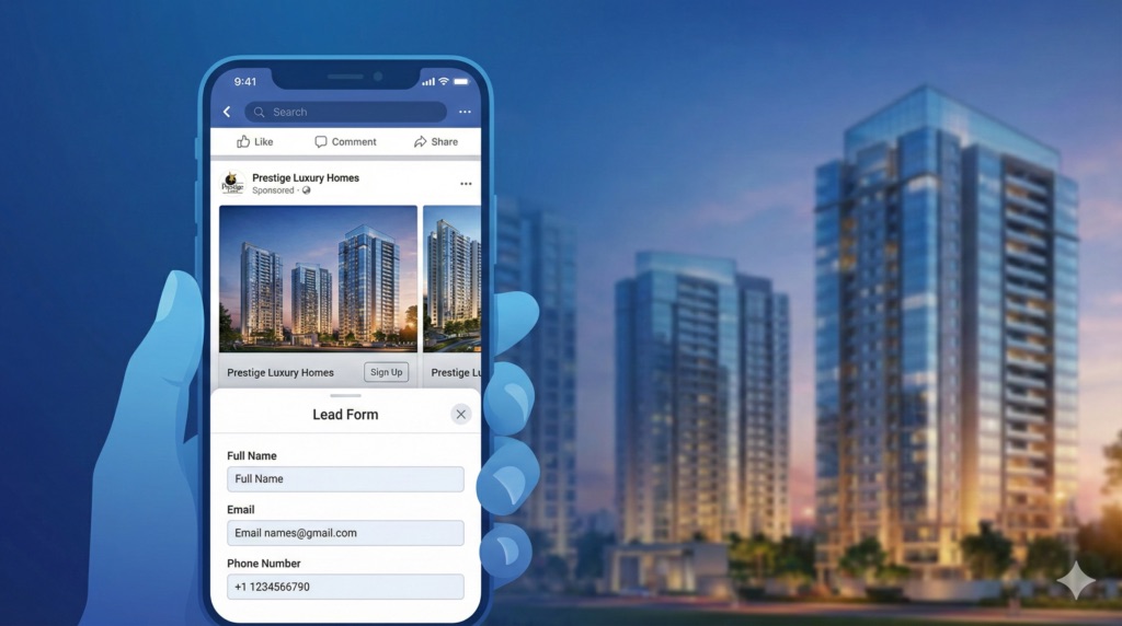
A landing page converts when it has one clear headline matched to the ad that brought the visitor, a CTA visible without scrolling, a short form, visible trust signals, and fast mobile loading — and it keeps converting only if it's tested and adjusted rather than left untouched after launch.
Match the Headline to the Ad, Not Just the Business
The single biggest drop-off happens in the first three seconds, when a visitor checks whether the page matches what they just clicked on. A headline that repeats the exact promise from the ad ("3 BHK in Sector 90 — Price & Floor Plan Inside") converts far better than a generic company headline ("Welcome to [Company Name]"), because it confirms the visitor landed in the right place before they've had a chance to doubt it.
Put the CTA Above the Fold — and Repeat It
The primary call-to-action (a form, a "Get Quote" button, a click-to-WhatsApp link) needs to be visible without scrolling on both desktop and mobile. On longer pages, repeat the same CTA again after key sections — pricing, testimonials, FAQs — so a visitor who scrolls down to get convinced doesn't have to scroll back up to act on it.
Every extra field lowers submissions. Name, phone number and one qualifying question (budget range, timeline, or project interest) is usually enough to start a conversation — anything beyond that should only be added if the follow-up process genuinely can't function without it. A shorter form produces more raw leads; a slightly longer, better-qualified form produces fewer but warmer ones. Which trade-off is right depends on how fast the sales team can call and qualify leads after submission.
Show Trust Signals Where the Doubt Happens
Trust signals work best placed right next to the decision they're meant to support, not bundled into a separate "About Us" section. A RERA registration number belongs near the project details, client testimonials belong near the CTA, and Google review ratings or client logos belong near the top of the page where the visitor is still deciding whether to keep reading at all.
Design for Mobile First
Most paid social and search traffic now arrives on mobile, so the mobile layout should be treated as the primary design, not a scaled-down version of desktop. That means large tap targets for buttons, a form that doesn't require pinch-zooming to fill in, and a page that loads in a couple of seconds on an average mobile connection — a slow-loading page loses visitors before the headline is even read.
Test Before You Scale Ad Spend
A landing page's first version is a starting point, not a finished product. Testing one variable at a time — headline wording, CTA button color, form length, hero image — and letting each test run until the results are clear avoids scaling ad spend behind a page that's converting worse than it could. A specialized agency like RS Web Solutions typically builds a new landing page as a hypothesis to test rather than a final answer, then adjusts it using real campaign data instead of guesswork.
Real example: one RS Web Solutions real estate client kept the same monthly ad budget and improved from 18 to 48 leads a month — bringing cost-per-lead down to under ₹400 — by tightening ad targeting and applying exactly this kind of landing page and follow-up optimization, not by spending more.
Putting It Together
None of these elements works in isolation — a fast, trust-signal-rich mobile page with a confusing headline still loses visitors, and a perfectly matched headline on a slow, form-heavy page still won't convert. For the funnel this feeds into once a lead is captured, see how digital marketing agencies improve real estate lead generation end to end, and if the traffic is coming from Meta, see which Facebook ad types work best for real estate agents to pair with the right landing page.
Want a Landing Page Built to Convert?
Get a free consultation on landing page design, copy and conversion optimization for your campaigns.